Boma is a mobile app that serves the “last mile” of the retail chain, specifically traders and vendors who don’t have access to digital infrastructure and good business support. Paperboat was tasked with developing the identity.
A “boma” is Southern African word that refers to an enclosure, usually fenced in with wooden poles. It is usually a circular shape and often used to shelter animals overnight, but it also functions as a safe place for people to meet and talk around a fire. This echoes the intention behind this digital product: it is aimed at lower economic Southern African traders, and it functions as a central point through which to communicate with suppliers and customers, to place orders, and to manage deliveries and sales.
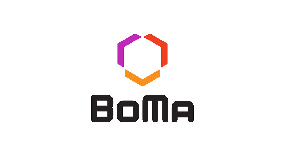
The logo is intended to be simple and iconic, with a colourful, recognisable logomark. Despite the simplicity of its shape, the logomark is complex in its visual associations. Firstly, it makes a literal reference to bomas; it is not circular of course, but it does suggest an enclosure in which its members meet face-to-face. Secondly, the negative space created by this enclosure is an isometric cube. The box recalls packaging and thus the major function of the app, which is to connect people and products, to manage deliveries and so on. Thirdly, the chevron shapes can read as directional markers pointing outward, suggesting again that BoMa creates opportunities for under-resourced small-business owners to make wider connections with suppliers and customers, and ultimately to grow.
Got a project? Talk to us about it.
Let Paperboat help you define a stronger purpose and build a sharper image.