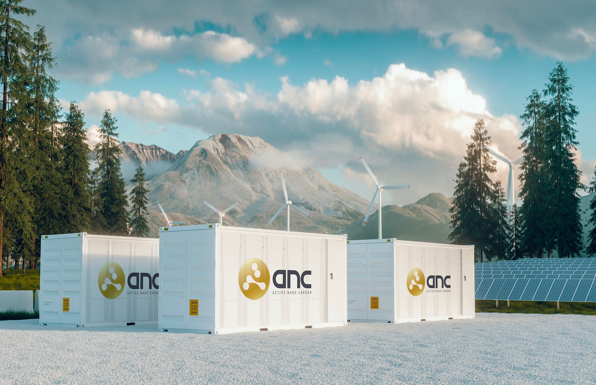
Active Nano Carbon (ANC) is a next-generation energy-storage company, bringing emerging graphene and graphene-hybrid supercapacitor technology to market internationally.
ANC approached us to develop their identity.
The Challenge
It was an exciting opportunity to create a brand for a tech company that is at the forefront of a paradigm shift in energy storage. We are eager to see this sector grow and begin to make electric vehicles, solar power, and other greener sources of energy the norm, and so we were keen to do our best work on this brand. Among the main challenges with this project were the six-syllable name with no obvious key word, and the very cliched imagery that is associated with atoms and nano tech. It was a challenge to design a balanced identity that is appropriate to the sector while also distinctive within it.
The Solution
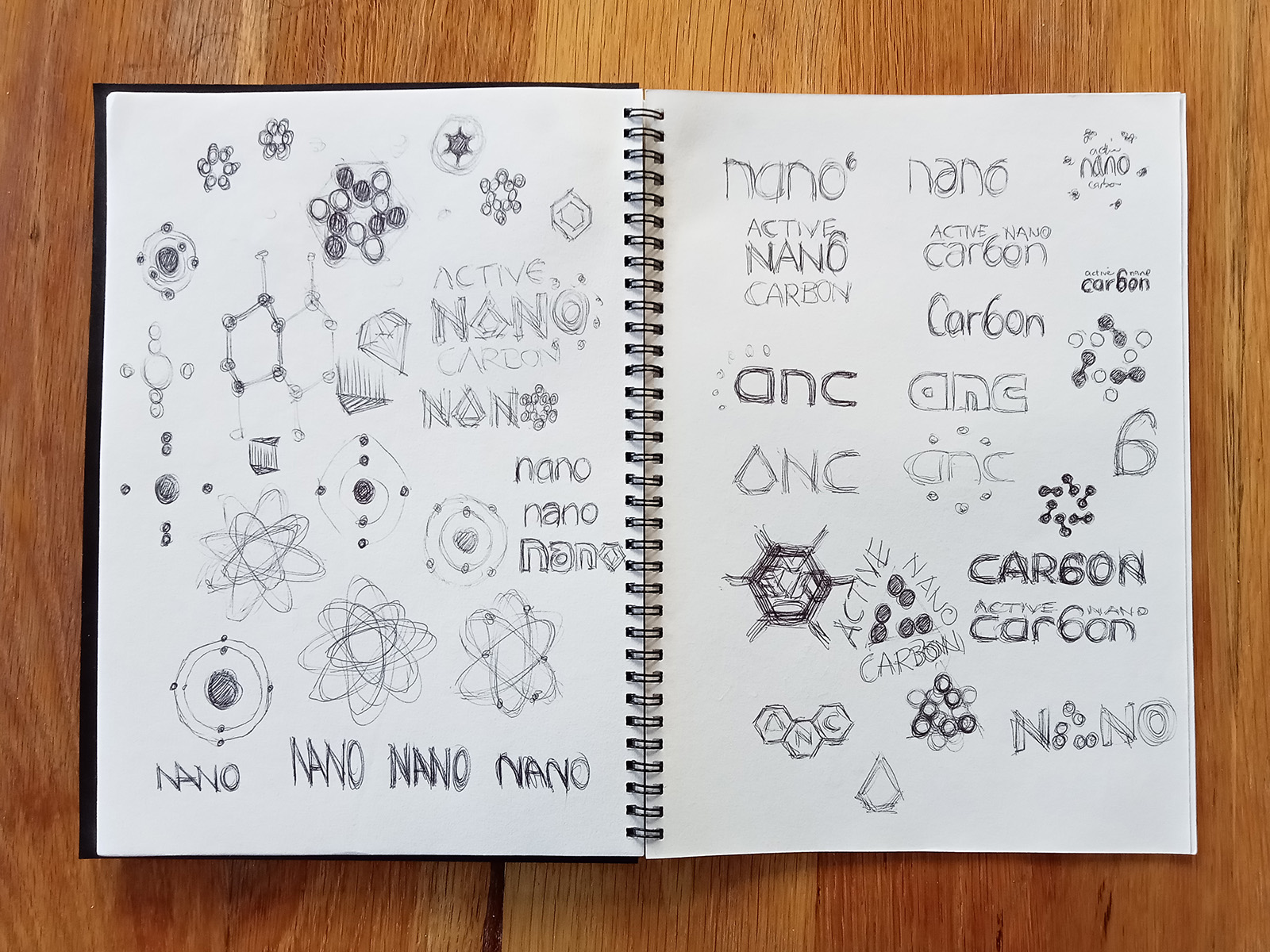
The graphene molecule is a very regular hexagonal shape, like a beehive, which is good for energy storage apparently, but not for logos. Atomic diagrams proved not to be any more inspiring. My initial scribbles struggled to find any strong visual or pleasing arrangement of the word forms, as you can see below.
Get the cliches out your system early, I say.
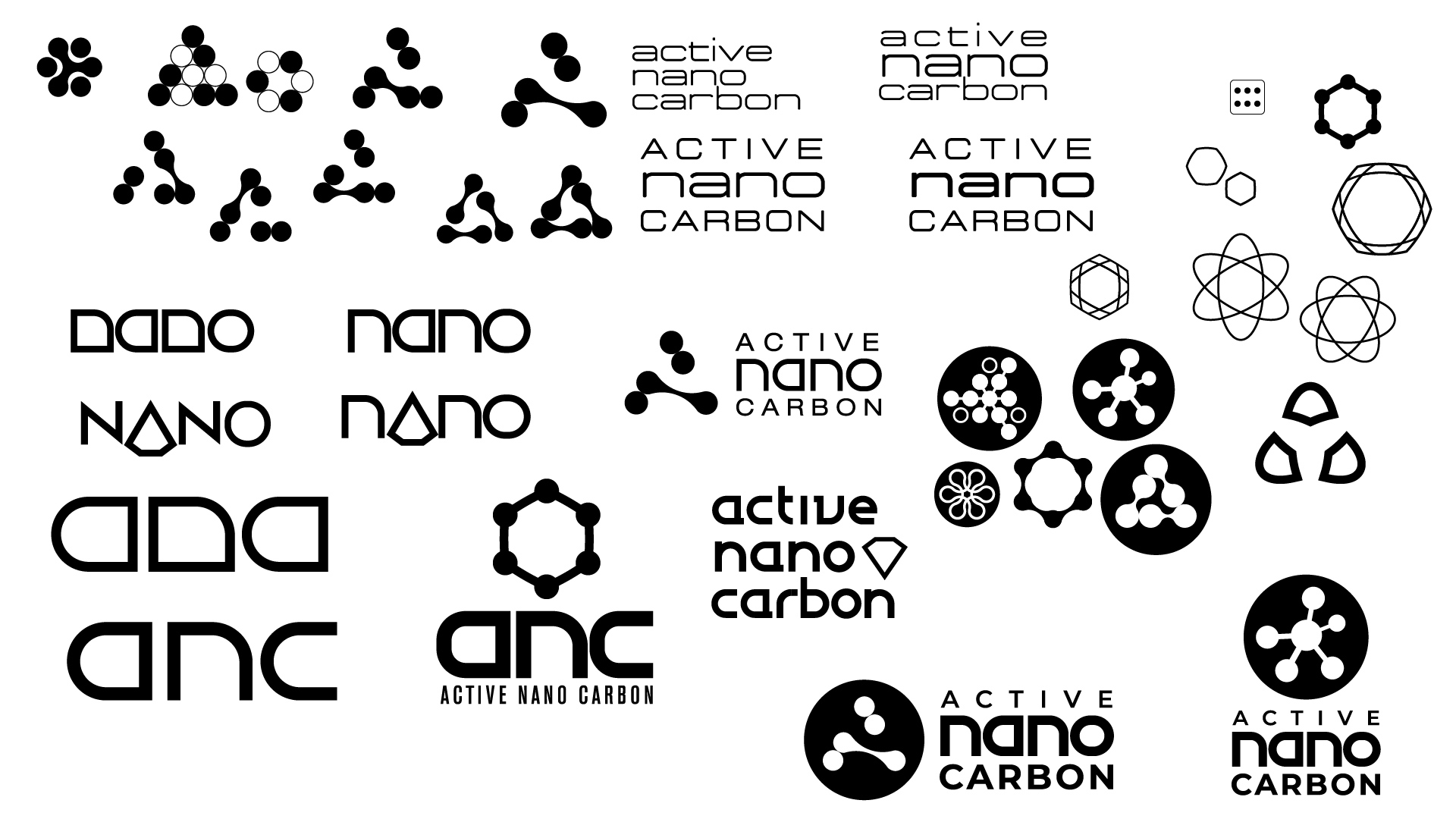
The most promising direction emerged from noticing some nice echoes in the letterforms of “nano” and “anc”. Our finished logotype built the initials out of essentially the same basic shape. It attains a level of sophisticated simplicity that I am proud of.
The accompanying logomark was not so easily decided. Despite its obviousness, we produced a number of options that referenced the graphene molecule or bonding of some kind.
Ultimately, we settled on a mark that references bonding and the initial “A”.
Why are there only five atomy bits when graphene has six? Because sometimes art must win out over science.