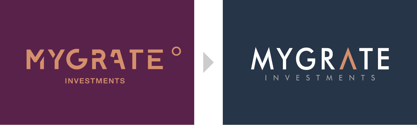
Credit must go to the previous designer for attempting to create unique lettering for the logo. We felt, however, that the original logo was let down in a few ways.
The main problem is appropriateness. Stencil lettering looks very 1980s because home computers made stencils obsolete in the 90s. Even if one sees this type-style as belonging to deconstruction, not stencils, that still dates it to the late 90s. Deconstruction was a result of a level of design freedom that was made possible, again, by the accessibility of computers since the 90s. But it was always something that lent itself to edgy magazine layouts, not investment logos.
The second issue is one of balance. Deconstruction isn’t easy to pull off, and the broken lettering leaves uncomfortable negative spaces in this text. The proportions of the word “investments” are also out of balance. It occupies about half the width of the main logo and, given its close letterspacing and distance from the main logo, feels isolated.
Finally, the “degree” concept is tricky; degree symbols almost exclusively follow numerals, so it is not easy to read the circle with the right associations.
In our redesign, then, we abandoned the deconstruction and opted for a typeface that offers better balance and that feels more classic. An investment company should ideally project straightforwardness and reliability. We also increased the width and spacing of “investments” to give it spatial similarity to the main text to make it feel more integrated.
Conceptually, we merely adapted the “A” to resemble a north-pointing arrow. We arrived at this point via the “V” shape of migrating birds. The final result is simple, clean, and easy to understand. We chose a typeface that has an “M” featuring complementary shapes so that the feeling of direction is reiterated.
We kept the lovely, warm orange that the first designers chose, but paired it with a blue grey to accentuate it.