Lightbox is a startup consultancy based in the US, helping companies to shape and focus on their organizational mission, to develop healthy teams, and ultimately to make a positive impact on the world. Lightbox approached us to design them a logo.
The Challenge
The company gets its name from the lightboxes used by doctors, photographers, and designers to illuminate slides for careful examination. While the company is keen on the conceptual connection between this name and what they do, they prefer to be called LBX and have reserved a domain accordingly.
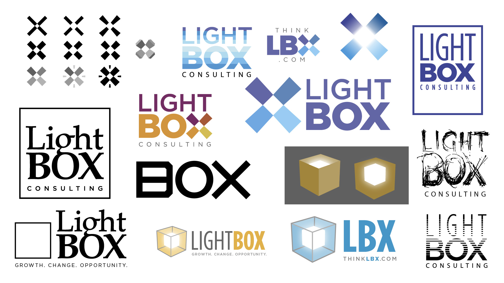
The challenge for this design was to provide a strong concept—without resorting to the many obvious clichés implied by the name—and to create a design that works as “Lightbox” and as “LBX”.
The Solution
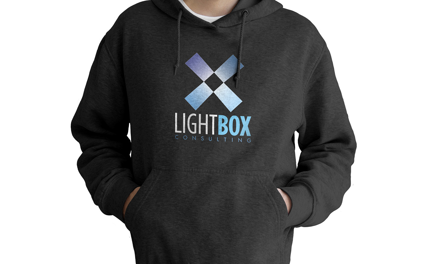
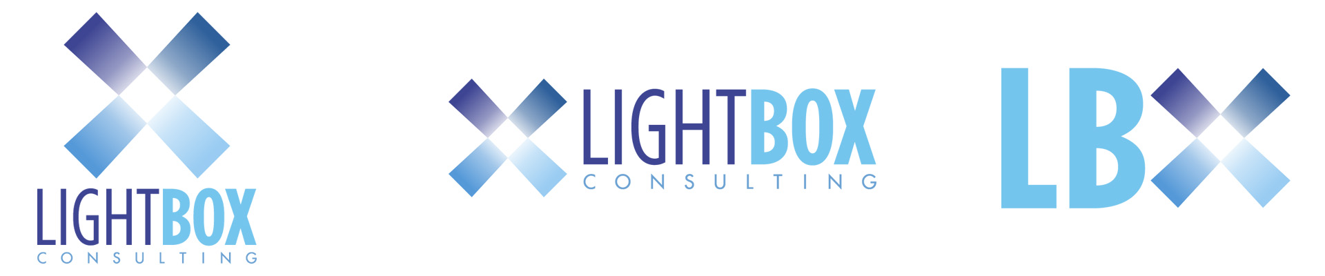
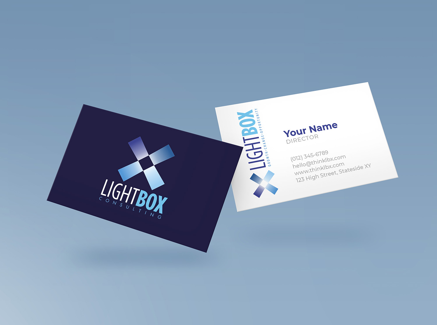
We aimed to reference the concept either by giving a sense of elevation or by enclosing a bright space. We quickly gravitated towards working with the X because it is a strong character within both “Lightbox” and “LBX”, and because it can be made to look like an unfolded box. The X also allows for a small square to be enclosed at its centre.
In consultation with the client, we eventually decided to add some glowiness to the centre of the box and to use the narrower text (even though it makes for a trickier “LBX” device).