Craft Consulting is an up-and-coming consultancy operating in the UAE, specialising in leisure and entertainment projects. Craft was looking to build momentum for their brand and an immediate concern for us was the strength of their logo. As a first step, we set about to improve their identity in order to provide a strong foundation for other brand-building endeavours.
The Challenge
The name Craft is good because it is simple, strong, nice to say, and it has great conceptual links with the consulting domain in which this company operates. The difficulty with a name like Craft for a designer is that the word is a verbal idea and doesn’t come with a body of mental pictures that one can draw on for inspiration. Because of the difficulty, we mean no disrespect to the previous designers when we say that their attempt to work with abstract symbols didn’t quite crack it the first time around.
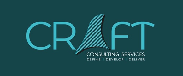
The original logo
Our criticisms of the previous logo are that it is rarely a good idea to make a logomark out of one of the letters in the word. It usually creates legibility issues, as is the case here, visually separating the CR and FT. And the logomark itself is hard to interpret. Is it a shark fin? Why is it a shark fin? (It may not be a shark fin, but I live on the False Bay coast and so it’s certainly what I see.) The font has some distinctive qualities, but the rounded F and T create an awkward mess of angles where their tops (almost) meet.
For our redesign, the goal was to create a distinctive logo that communicates the qualities of creativity, reliability, and professionalism that befits a consultancy of Craft’s calibre, and that makes more recognisable links to the idea of craftsmanship.
The Solution
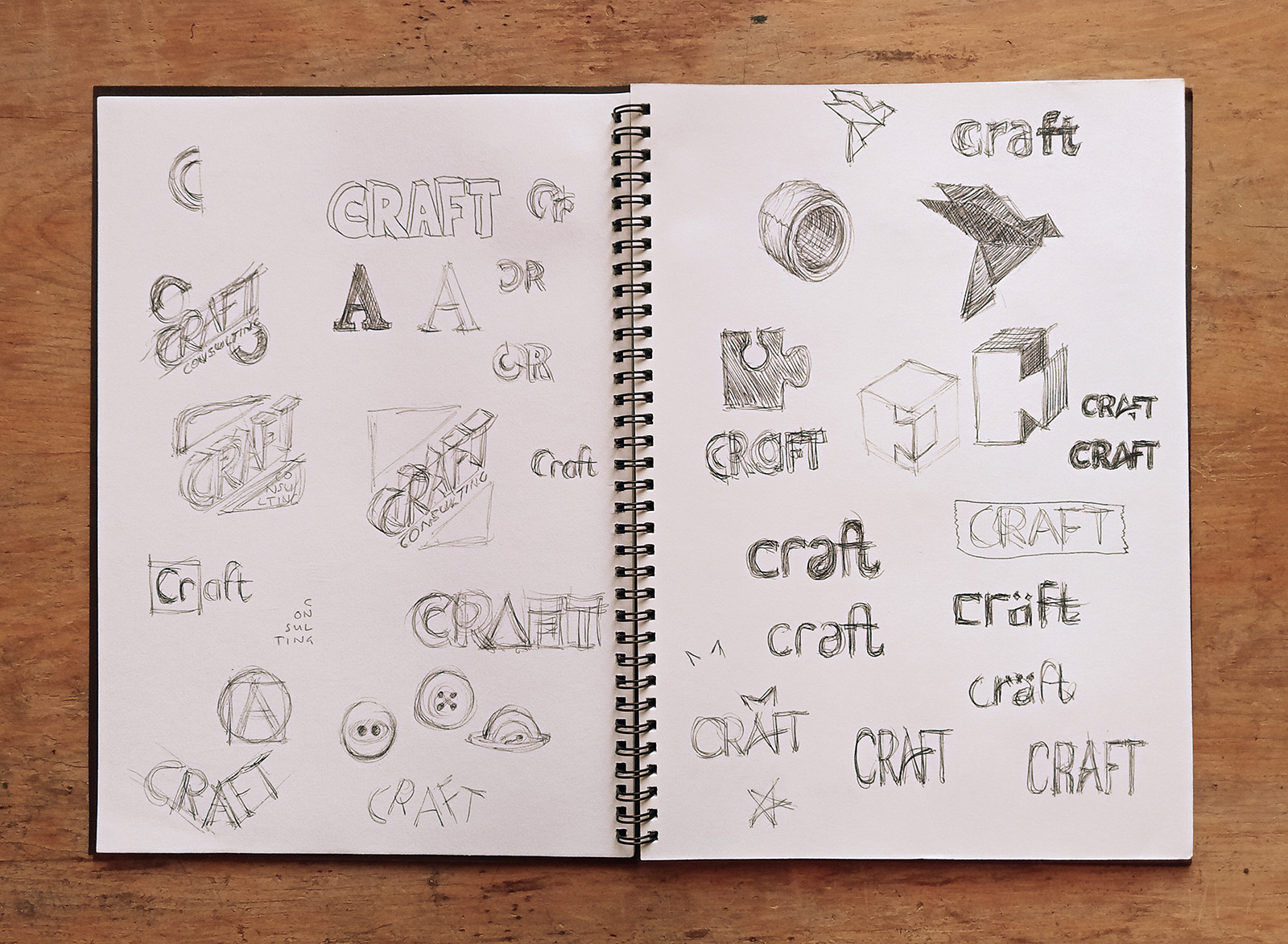
Our first concept drawings built on two possible directions: We either wanted to create a typographic solution that appeared hand crafted or we wanted to create a symbol that drew connections to actual arts and crafts.
The sketchbook allows one to discover which ideas are bad very quickly
When we began digitising some of the more promising ideas, we liked the idea of calligraphy but quickly abandoned it because of (again) legibility issues. Craft is working in territories that are not uniformly first-language English, which makes it all the more important that the logo is readable.
Similarly, although we presented options based on the logo on the bottom right, and although it might be my favourite of any logo we’ve produced so far, the same legibility concerns apply here too and the client rightly chose a different option.
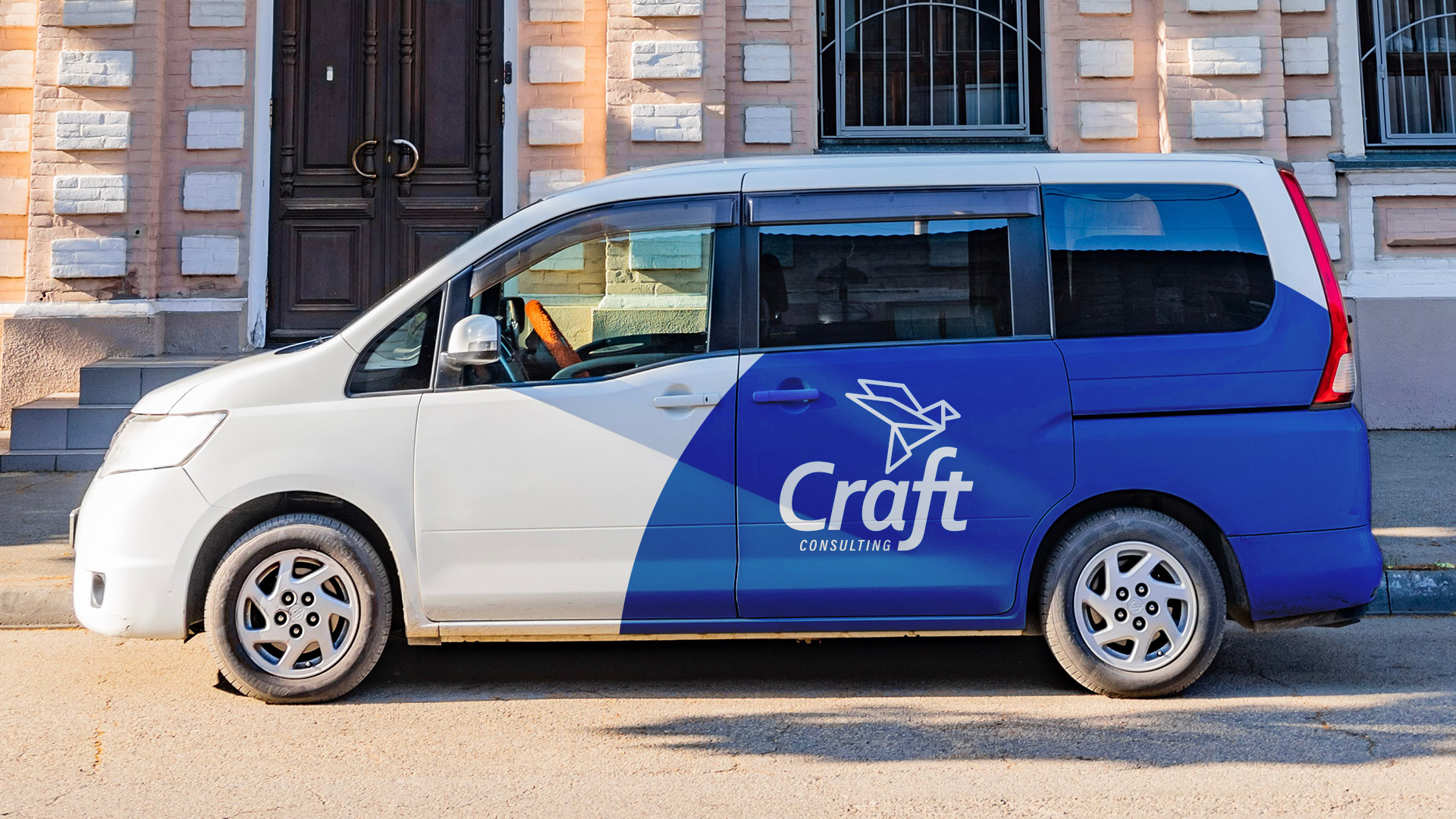
We decided to proceed with the logomark based on an origami bird. It is good conceptually because origami is obviously a beautiful and creative craft, but also because the image of a bird represents an idea, project, etc. taking flight, which is, of course, what a consultancy is for.
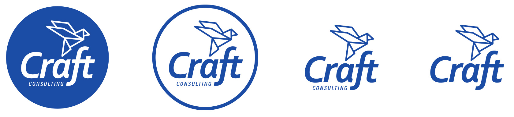
We think that this logomark is much more easily connected to the idea of craft, while also being a distinctive and visually interesting symbol in its own right.
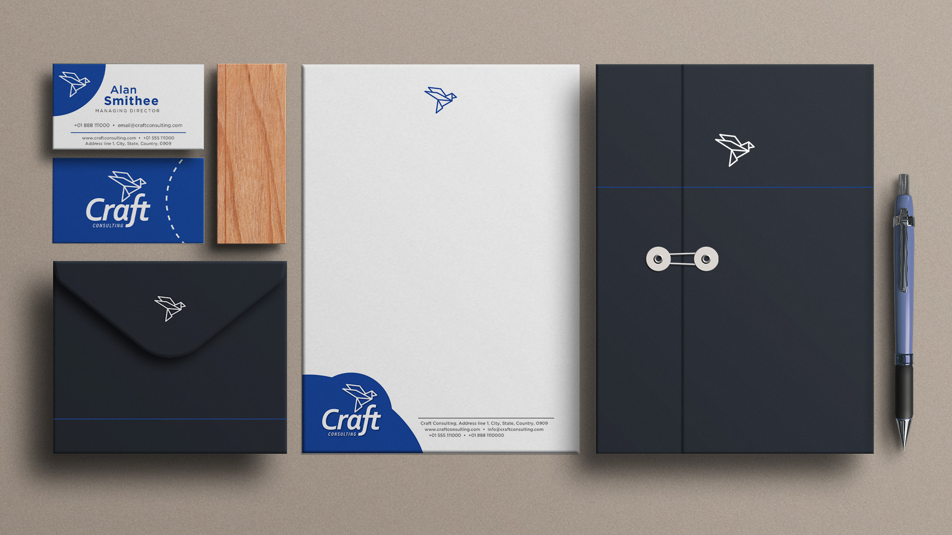
The Finished Logo
Here is the finished logo:
We exaggerated the tail of the F to anchor "consulting", which is intentionally off centre to balance the bird icon.
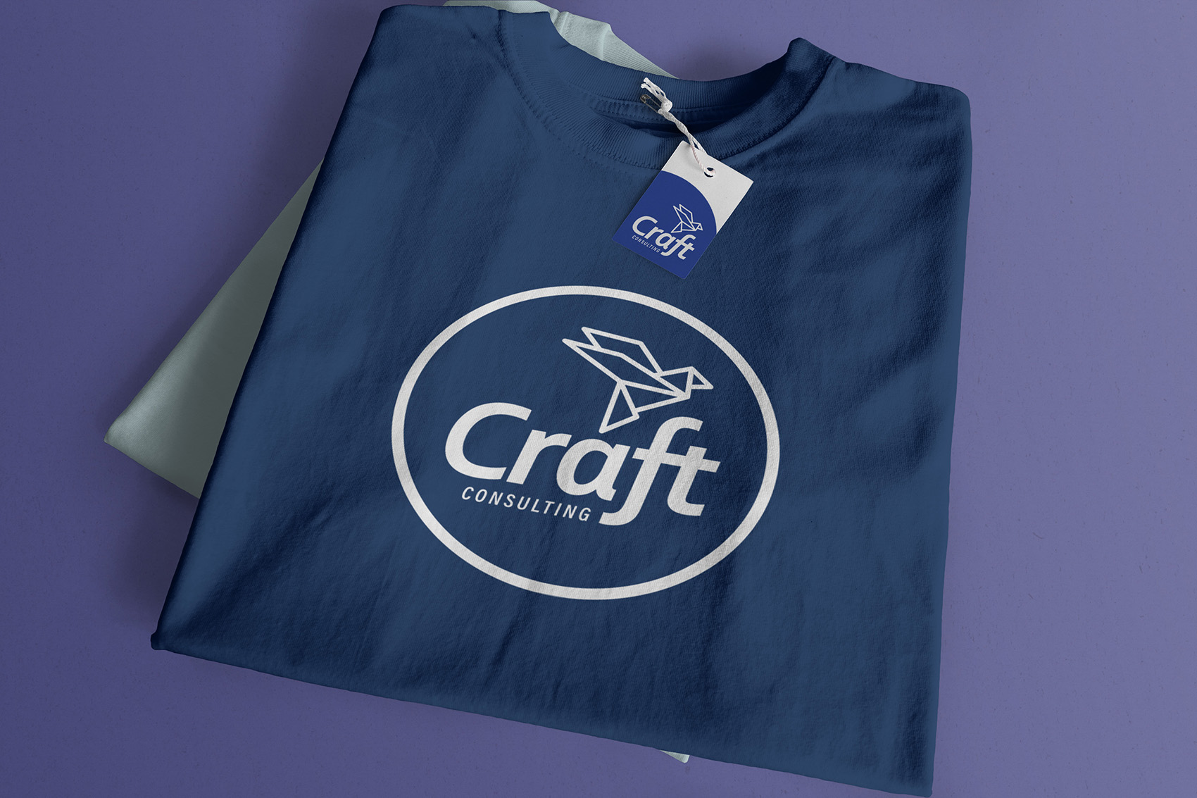
The circle motif can be used flexibly to create interest.
This shows two different executions of the circle motif.