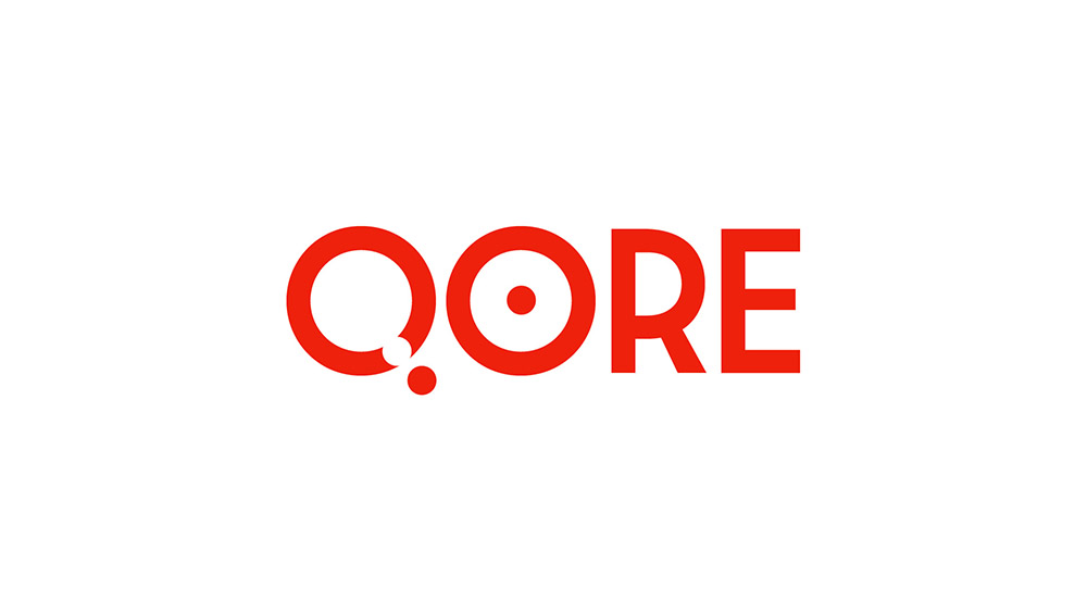
Paperboat was involved in a development and marketing-strategy process for a proposed e-sports team based in Qatar (hence the substitution of a Q into the word “core”). A logo had already been developed before our involvement, but we wanted to suggest a new option.
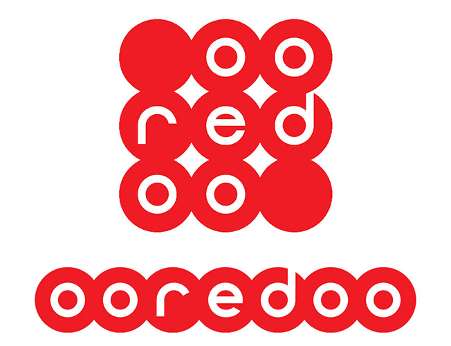
We did not suggest a change to the original Qore logo, as pictured on the shirt above, because there was anything wrong with it. It needed to reference the team sponsor, Ooredoo, which it does with the colour, and it fulfills the main criterion of appropriateness reasonably well. The blocky lettering invokes the digital e-sports environment (although computer graphics haven’t been blocky for a while now), and the italic type suggests dynamism and performance.
The main reasons why we thought it should be replaced are, firstly, that the original logo is not very memorable. Besides the unusual Q and a slight modification to the E, there is very little to help it stand out, and it feels a little generic. Secondly, we felt that the logo missed an opportunity to reference the sponsor more directly and, in doing so, to improve the distinctiveness of the logo.
The Ooredoo logo makes a feature of the repetition of O shapes in the name, selecting letterforms that play to the circles in which each letter is set. The name “Qore” offers the same potential. Of course, each of the letters of Qore could be made to fit a circle in exactly the same way, but we wanted to avoid merely copying the logo treatment. We aimed to create a Qore logo that seemed to be a unique member of the Ooredoo family. Rather than setting the letters within circles, we adopted circles as details within our lettering.
We have referenced Ooredoo by choosing to represent the Q and the O with circles. This enables one to see a reference to the first four letters of “Ooredoo” in this logo.
The dot within the O emphasises the idea of a core, and the dots are carried through into the the diagonal stroke of the Q too.
When removed from the Ooredoo circles, the lowercase R and E leave uncomfortable negative spaces, so we avoided mimicking the Ooredoo logo in this way too. We also liked the added boldness of the capitals for the competitive gaming environment.
Got a project? Talk to us about it.
Let Paperboat help you define a stronger purpose and build a sharper image.